CarTrawler is a B2B provider of car rental and mobility solutions to the global travel industry.
CarTrawler creates solutions for some of the world's largest travel brands, including American Express, Alaska Airlines, easyJet, eDreamsODIGEO, Hotels.com, KLM, TravelStartand Emirates.
Their main product is a white label Internet booking engine that enables end-users to search for and book Transportation online.
YEAR AND LOCATION
2019, Dublin, Italy
CLIENT
CarTrawler
DESIGN AREA
UX/UI Design
MY ROLE
As the principal Product designer in the Desktop and mobile engine product, I facilitated the sessions that lead to the definition of the problem, produced wireframes and prototypes, prepared the unmoderated user tests and delivered the final designs.
I worked with Marketing, Engineering and Insights teams in a cross-functional team specialised in performance optimisation through A/B testing.
The Problem
In early 2019, due to technical constraints, the user interface of the main product provided a primitive and limited set of filtering options, discouraging their use.
Data insights indicated that users interacting with the filters panel on the results page were more likely to convert.
Using the existing codebase and technical infrastructure, we wanted to explore new ways to grow the filters' interaction rate, enhance the results' relevance and measure how this translated in terms of conversion performance.
Sketches
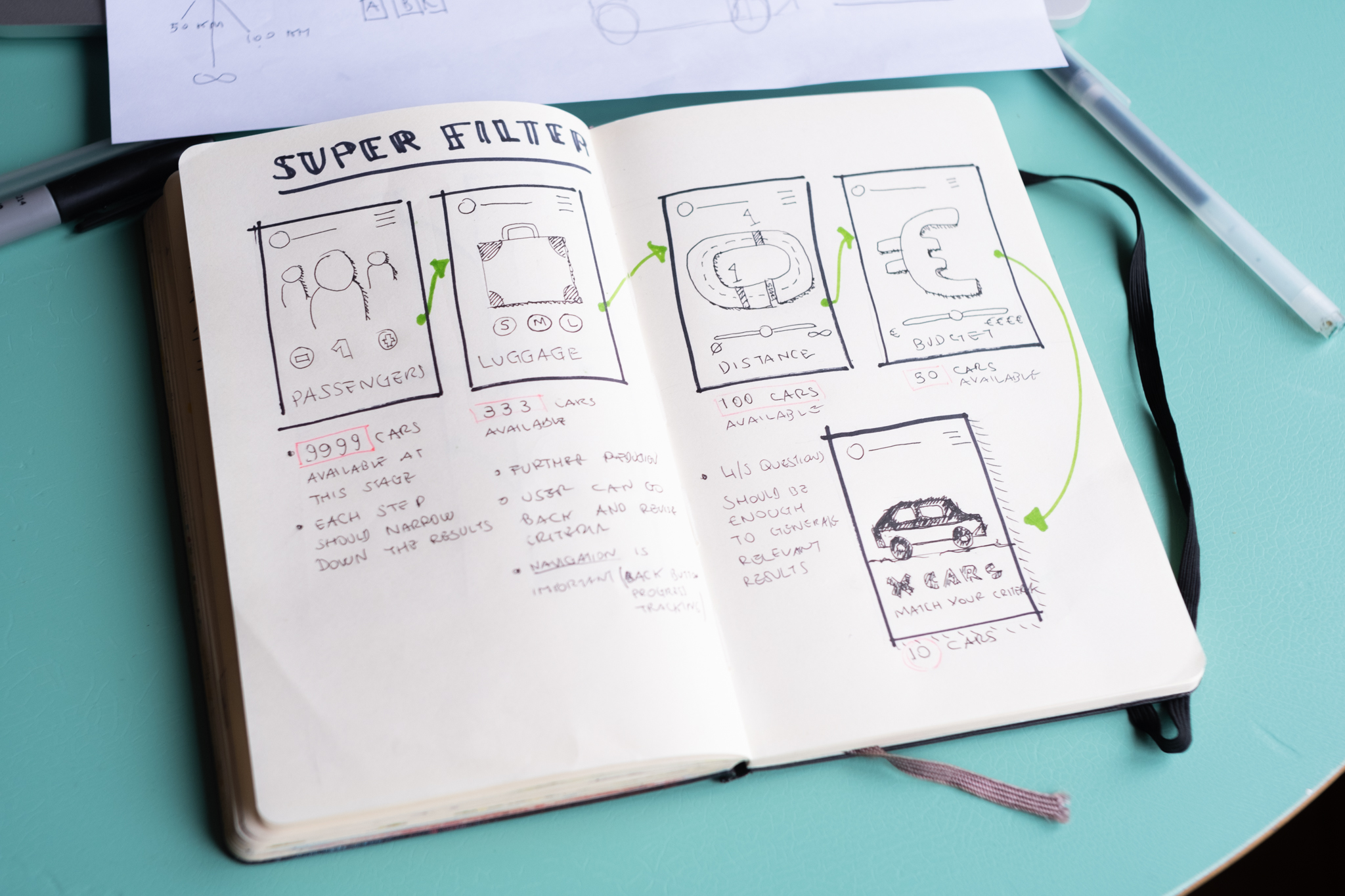
After running an ideation workshop with the team, we mapped the generated ideas to an impact & effort matrix. We voted for the most actionable ones within the high impact low effort quadrant.
Starting from this knowledge, I began to sketch on paper a slightly more refined version of the idea we wanted to build.
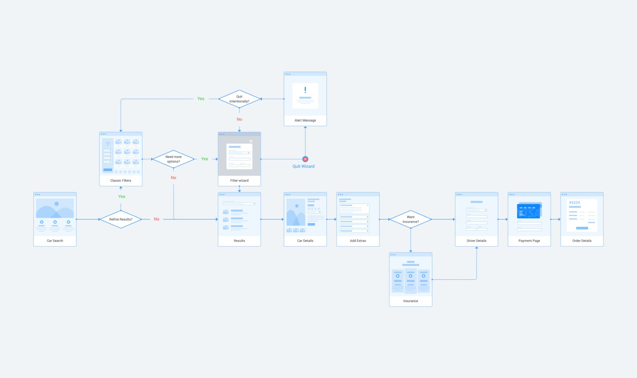
User Flow
I mapped out the user journey to determine the areas that needed improvement and communicate the products’ screens with more clarity to those less familiar with it. The chart also helped me identify and correct any gap in the flow.
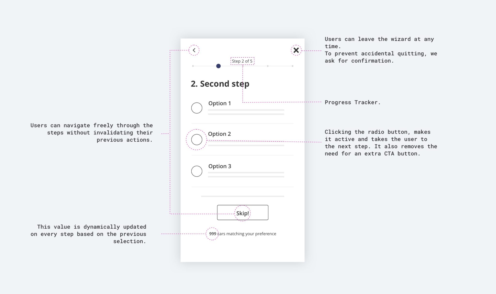
Wireframes
I produced a few wireframes to present and outline the essential anatomical parts of the solution to be prototyped and tested. This was also helpful for the design handoff and for updating the design system.
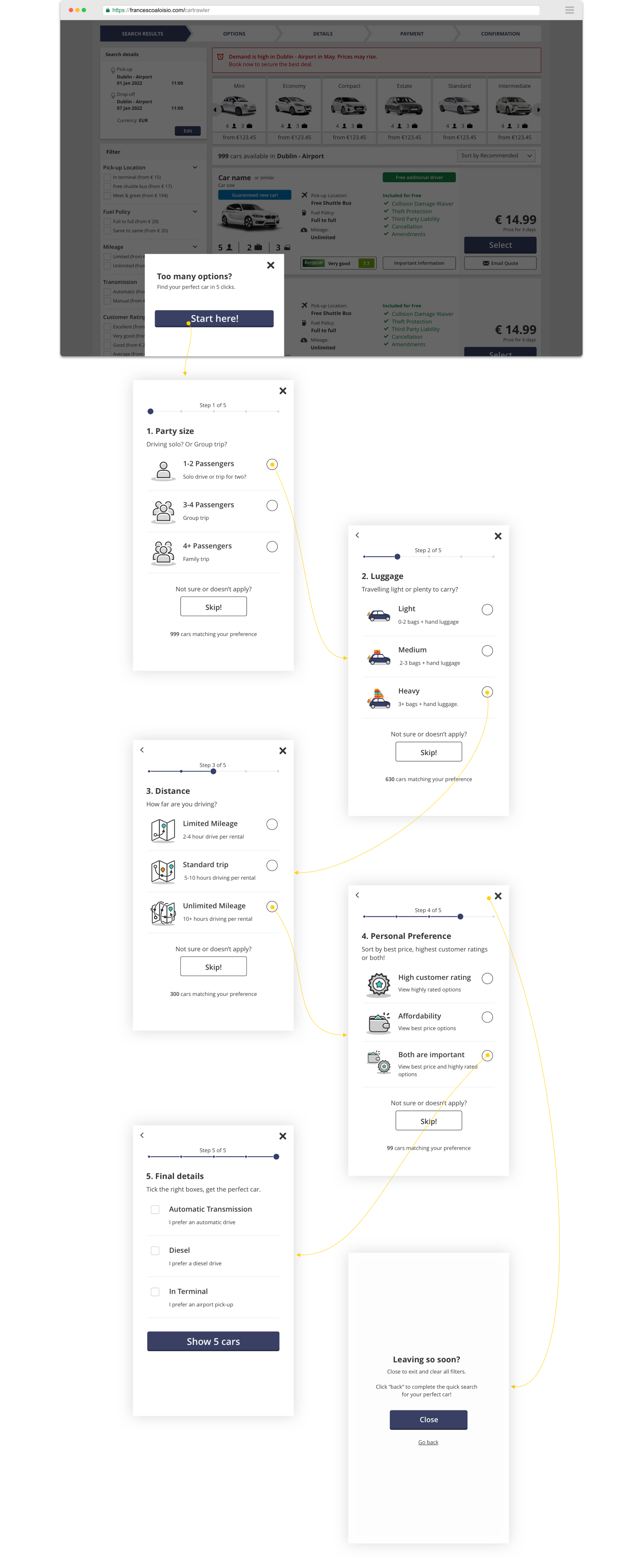
Prototype
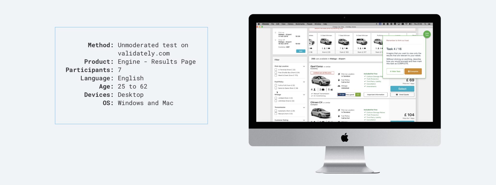
Using Sketch and InVision, I prepared an interactive prototype to be used for an unmoderated test on validately.
User testing
Before handing off the design to the developers for the A/B test, I ran a testing round to reveal usability threats and opportunities for improvement.
Expected Learnings
- Current Filters
How do users search for content suitable to their needs? - Purpose
Can users understand or predict what problem this feature we are providing is trying to solve? - Language
Do users understand the questions we ask and the different options? - Closing the window
What do users expect to happen when they click the close icon? - Misc
How do users evaluate the overall experience? What else did they notice?
Key findings
Current Filters
6/7 users intuitively interacted with the filter columns when asked to narrow down the results from the page; all users sorted the results "by price", however only 2/7 users barely noticed or interacted with the filter carousel.- Usability and purpose
Almost everyone (6/7) understood the mechanics and purpose of the proposed feature, and all users were able to navigate from screen to screen flawlessly - Language
When asked to rate their comprehension of the questions in each step, the level of understanding was very high, except for one question where 3/7 users expressed confusion/ambiguity over the definition of luggage sizes. - Closing the window
The majority of Users expected the helper window to close with no effect on the results list when hitting the cross button. - Misc
In general, users rated the overall experience quite positively, with an average score of 4 out of 5. However, the score for the likelihood to use this feature in a real scenario didn't perform as good (3/5)
Recommendations
- Consider adding an extra step to confirm if a user wants to exit or go back to the helper window when they close the modal.
- Add the words “per day” in each distance description.
- Consider sorting result "by price” instead of “by recommended” by default.
- Provide better descriptions in the S2 section (Define what is light, medium, heavy).
- Change text on S3 as not every user is acquainted with the term customer advocacy.
Wrapping Up
This project was part of a larger initiative concerned with the optimisation of the conversion funnel through quantitative testing. After amending the designs based on the recommendations from the user test, the feature was deployed for further quantitative testing and actual implementation.
The results from the A/B tests, and the design iterations that followed up cannot be disclosed due to their confidential nature.