In April 2018 Fastweb Digital Academy held an advanced UX/UI workshop in Milan. To simulate a client-designer collaboration, they partnered with Sharewood, a company specialised in outdoor equipment rental for bikes, water and snow sport.
The client wanted to improve the usability of their product, by addressing issues occurring in specific areas.
We were 24 Students coming from different backgrounds including psychology, design, and journalism. We worked in mixed teams of 4. The outcome of the workshop was a set of solutions produced at the end of an iterative design process described below.
YEAR AND LOCATION
2018, Milan, Italy
CLIENT
Sharewood.io
DESIGN AREA
UX/UI
MY ROLE
I wrote the interview script and conducted the User interviews; designed the wireframes and built the prototype.
CREDIT
Team: Alberto Lot, Alessandra Marafetti, Alberto Motta
Facilitator: Alessandro Contini
DAY 1
Evaluation of the website
We conducted a heuristic evaluation of the website using the client’s brief as a loose framework.
Each student was allocated 10 minutes to test the website and take notes of relevant usability issues. At the end of the session, the outcome was discussed, and a severity code assigned to each item.
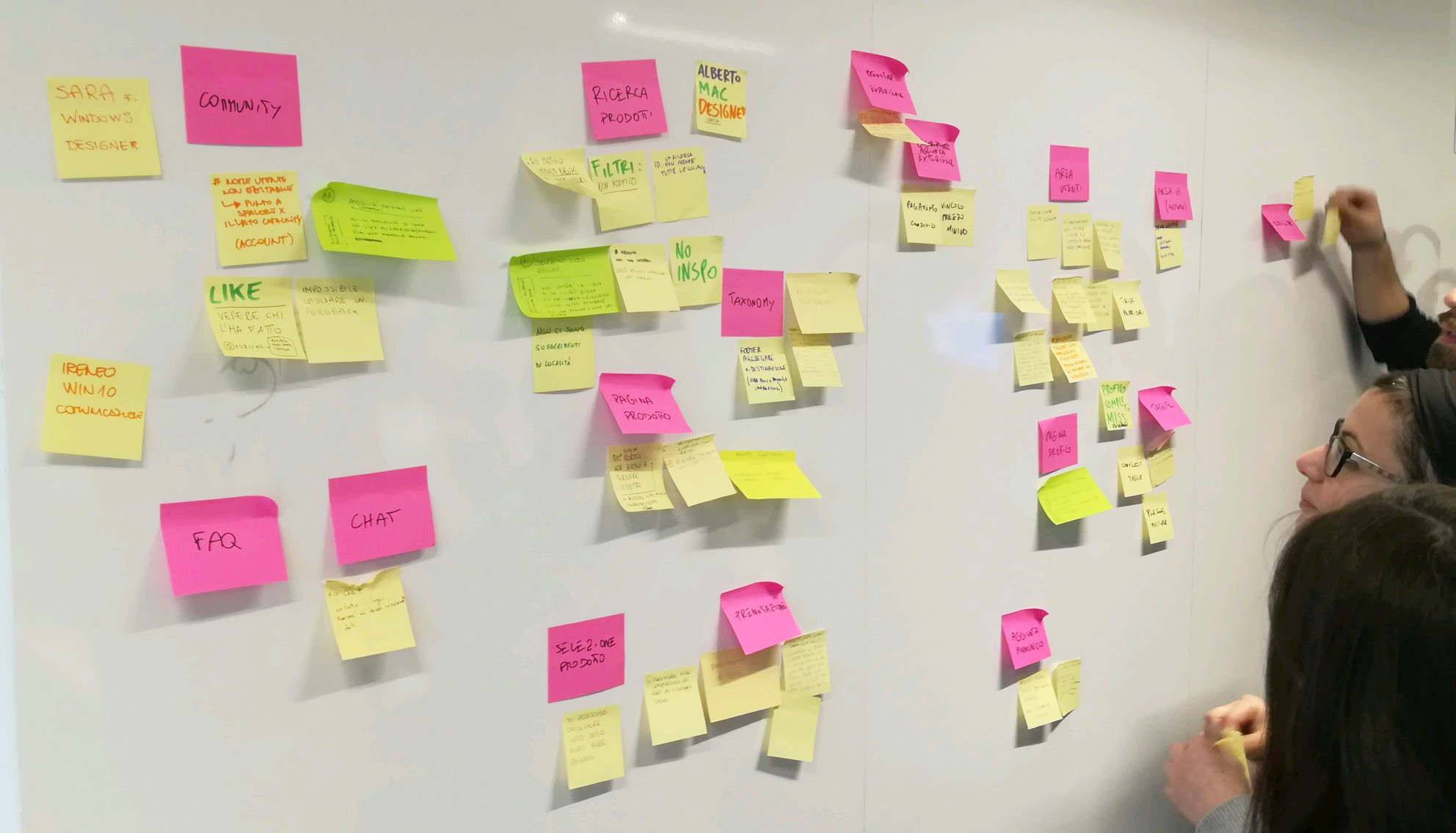
We classified them by category and voted for the ones that needed the most attention respectively: mobile app, user community, listings page, experiences section and product search. My team was assigned the product search.
DAY 2
User interviews
The data retrieved during the previous step provided useful insights for the preparation of the questions to ask. We wanted to learn as much as we could about our users’ goals motivation and pain points and use the information to find
out why a percentage of them was leaving on the search results page.
We were also interested in any recurring pattern that would match data from our initial analysis. For this purpose, we interviewed two random users in line with the Sharewood demographics and one existing Sharewood customer.

Giulio

Niccolò
Giorgia (Sharewood User)
We warmed up the conversation by asking some generic questions and then delved into the subject of our challenge and eventually assigned a task to execute on the website to study their behaviour and possibly identify any pain point.
Everything was recorded and the most interesting parts summarised as user quotes.
“The Winter sports category was a little too broad, I wished I could search directly for ski…”
Giulio
“I simply couldn’t find what I was looking for, I left the site and searched elsewhere…”
Niccolò
“I knew the approximate area but not the exact spot.
The location-selector only allowed a specific choice…”
Giorgia
DAY 3
Hypotheses
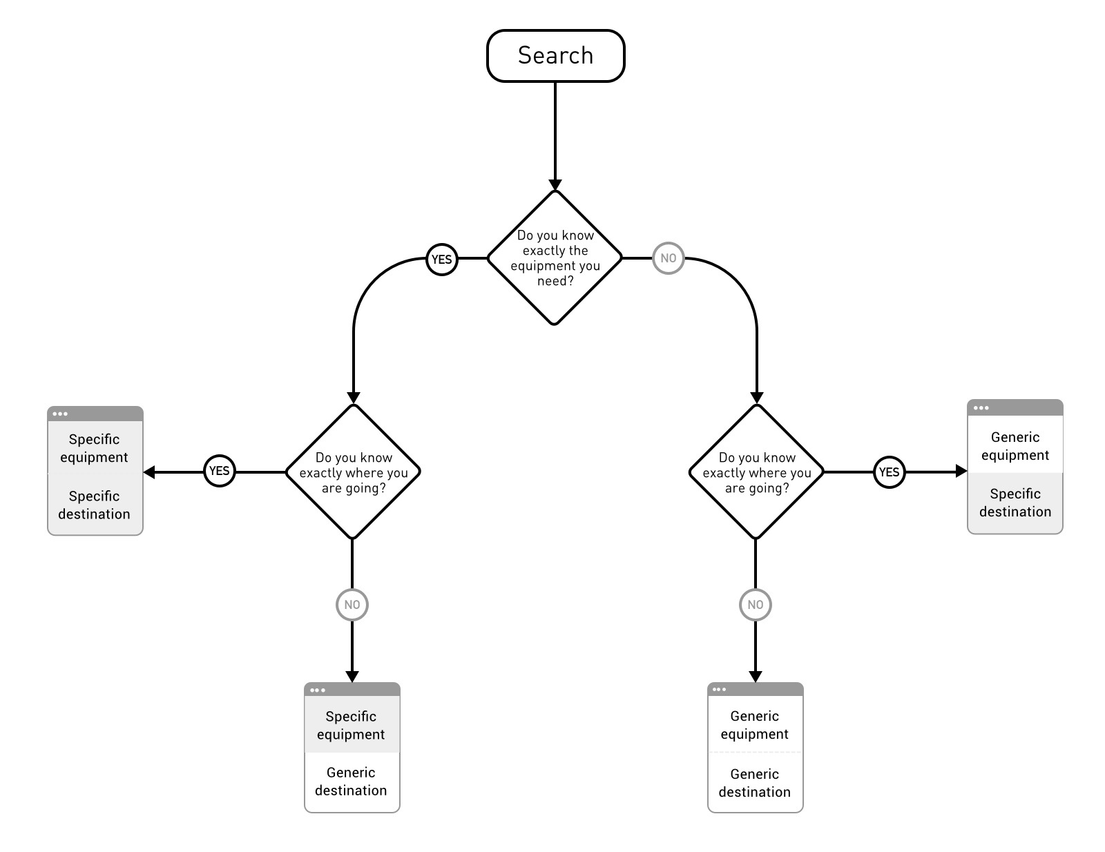
We believed that the current search option was taking into account only the needs of one type of user: those who knew precisely what and where they wanted to rent.
This constraint was causing the frustration of those users who whished to choose the location independently from the type of sports equipment and vice versa.
We hypothesised that removing this limitation and allowing more freedom in the search would accommodate a broader audience and reduce the percentage of unsuccessful users.
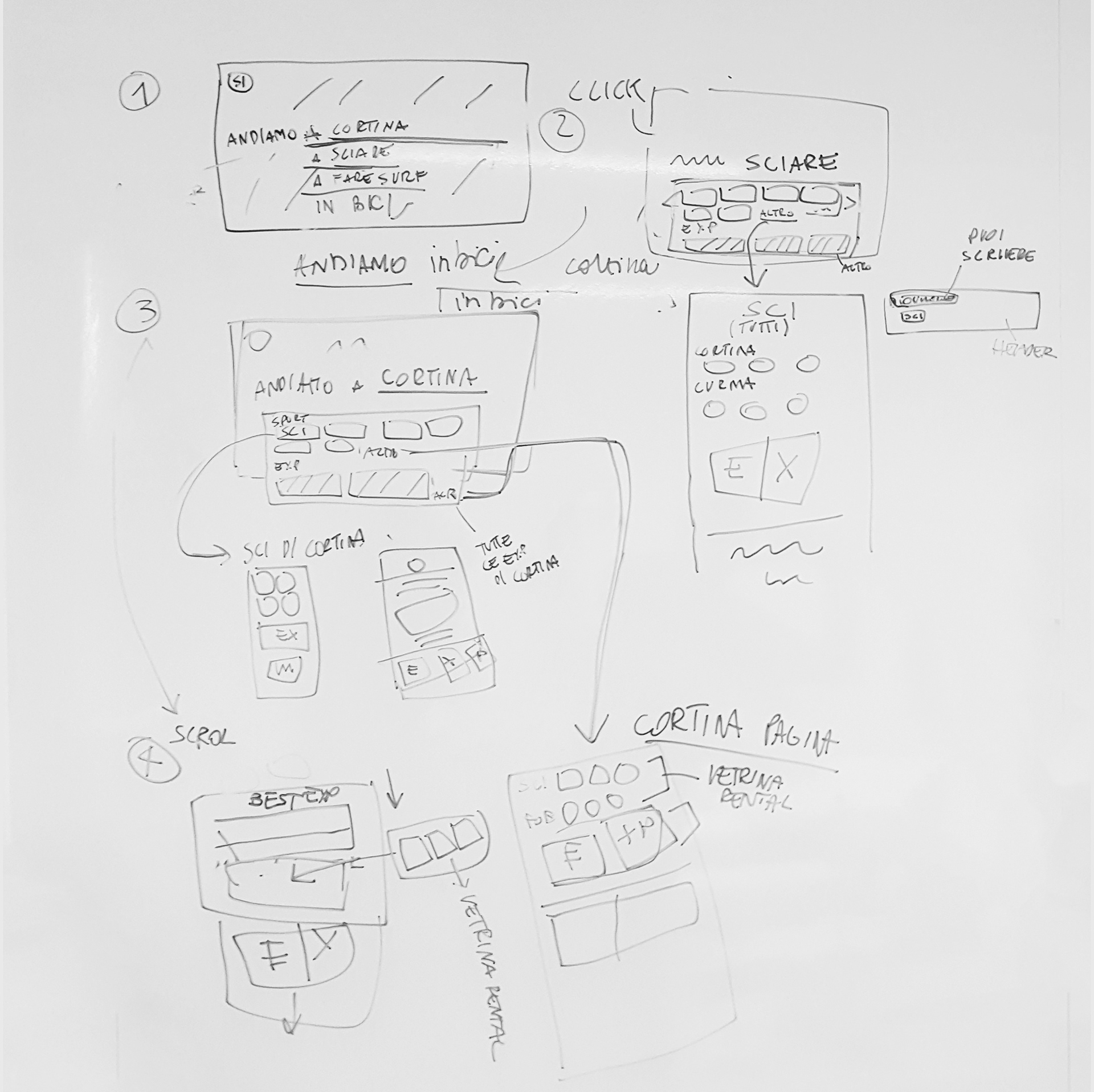
Soon after we began sketching on paper some user flows and rough wireframe:
DAY 4
Wireframes and User testing
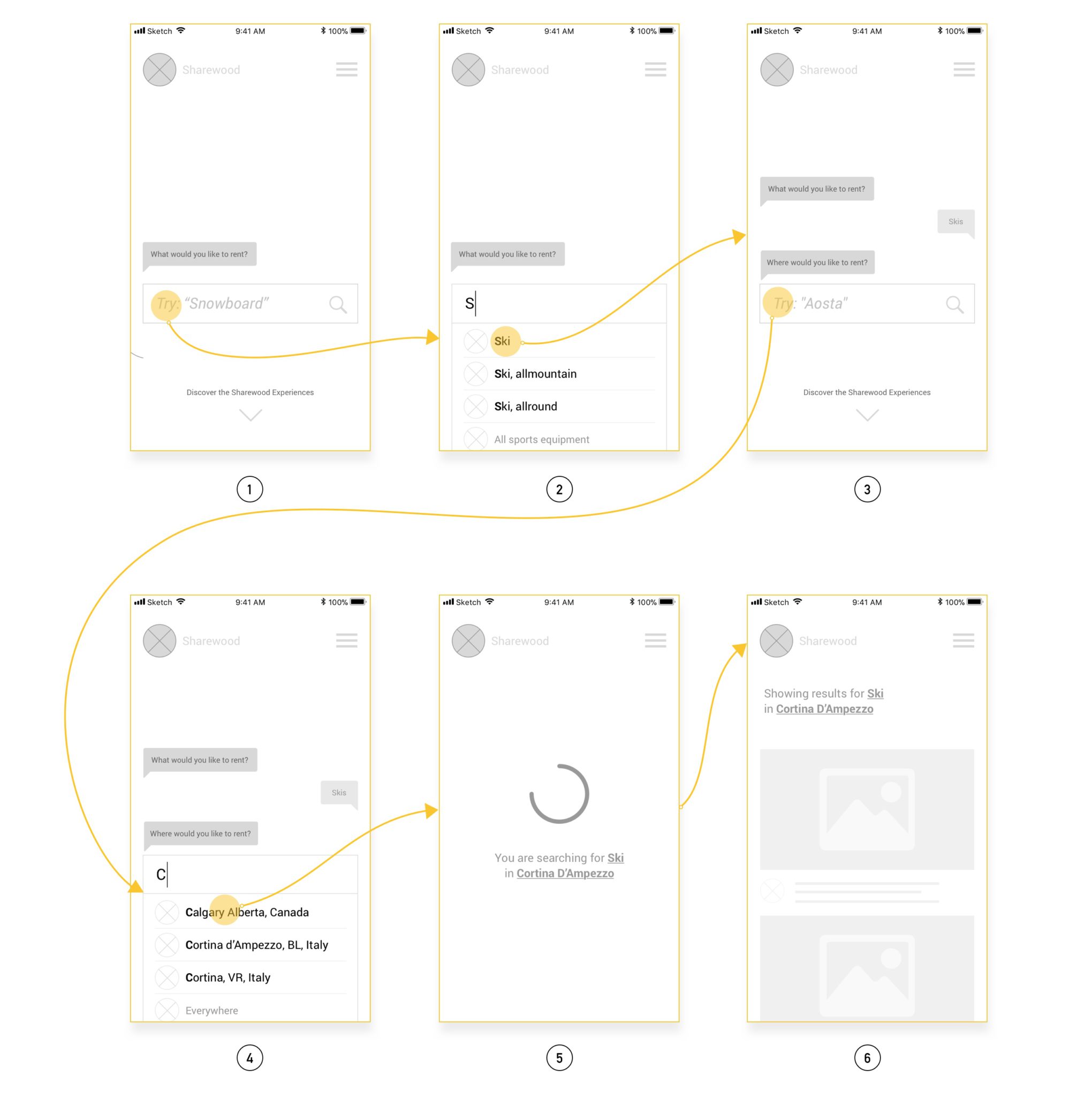
From the paper sketches and user flows we moved to proto.io, Sketch app, and principle to quickly create an interactive lo-fi wireframe that we could test on lookback.io with some real users, this allowed us to quickly find and fix apparent issues before producing the actual hi-fi prototype.
- We split the interaction into two different steps using a conversational approach. On the first screen, we require the user to chose the type of equipment he/she wants to rent.
- It can be a generic broad category/free text or a more specific subcategory/ specific item.
- In the second step as the conversation moves forward we ask for the destination
- Again the choice can be a more generic Region/area or a very specific town/ location
- As the system retrieves the relevant content, we display a loading status and a recap of the query
- Results are then displayed.
DAY 5
High definition prototype
On the last day, we created high definition prototype and tested it with real users before presenting it to the client along with the other solution designed during the workshop.
